


Knowledge Navigator is a BCG internal search engine for BCGers to obtain knowledge to drive case/proposal success.
Challenges & Goals
The project is to refine and further enhance the Smart Search experience launched in 2018, in order to increase user utilization and satisfaction. We aim to design a search experience that provides users with ‘Best Answer’ for searches in the new Knowledge Navigator. To get there, we need to achieve the following two goals.
1
Enhance the Smart Search Experience
by enabling increased content coverage, improved relevance, persona coverage, and tech delivery
2
Enable a coherent product experience
by ensuring a seamless and easy-to-use experience for all target users to navigate, consume, and share rich BCG knowledge
My Role
Mar. 2020- Jun. 2020
(3 months)
I played a key role in redesigning the Smart Search experience and delivered further intuitive and smarter interfaces. Specifically, I conducted two rounds of interviews and testing, visualized improved and validated interactions, and delivered high fidelity outcomes ready for launch by working in rigorous research and agile design process.
Key Deliverables: User Interview Conduction, User Journey Mapping, User Testing, UX Audit, Exemplar Analysis, Wireframe, UI and UX, Animated Prototype for Micro-Interaction
Problem | Low Usage of Existing Design

Delivered New Experience
_____
Improved Interfaces in Key User Flow
I have delivered interfaces across the four key user steps of the searching experience and those steps cover all the features and interactions we need to redesign to enhance the Smart Search experience. For highlight, there are more than 20 micro-interaction designs that include in those interfaces to serve a coherent search and results consumption experience. The following section demonstrates some of the demos and animated interactions.

New Design, Enhanced Experience
I delivered animated prototypes in Principle for each of the new features. It's critical to provide explicit documentation to accurately communicate the interactive models with other team members, especially with the engineering team, to ensure the right implementation and reach the ultimate goal of reducing search frictions and improving user usage.
* In the following session, the improvements are highlighted with the pink boxes alongside the old design
1. Search Initiation - Search Bar With Auto Suggestions
Idea
Auto-suggest search experience accommodates multiple content types, while dynamically displaying number of results, within each suggested search term suggestion
Benefits
• Provides instant feedback on the relevance/accuracy of search terms
• Reduces the need to refine a search result, after the initial search of a keyword/term
New Design Demo with Micro-Interactions
Before and After Comparison
Improvement


Before
After
2. Search Initiation - Advanced Search
Idea
Quicker access on the homepage, for power users to start searching with advanced parameters
Benefits
• One search experience combining the specific search parameters, as well as providing additional filters to refine for more accurate search results
• More visible hierarchy to switch between initiating search for a specific content type
New Design Demo with Micro-Interactions
Before and After Comparison

Before
Improvement

After
3. Search Result Presentation - Result Presentation/Expand View

Idea
Refined design approach to organize the content in both expanded and collapsed views that resonate with the overall Smart Search result page experience
Benefits
• Users have more visibility on documents within each material result module
• Micro-interactions allow for users to have primary, secondary and tertiary actions to work with one another rather than compete for space and layout
New Design Demo with Micro-Interactions
Before and After Comparison


Before
After
Improvement
4. Search Refinement
Idea
Simplified filters and display parameters to allow for more search results to be displayed. The new layout maximizes filters and display parameters that are currently most used
Benefits
• Users can refine their search with less visual clutter on the top section of the results page
• Filters displayed will be the top filters used by users on Smart Search
• Exposed overlay of advanced filters allows users to filter and see results automatically updating in the background
New Design Demo with Micro-Interactions
Before and After Comparison

Before
Improvement

After
5. Result Consumption
Idea
Pinning documents can now be stored in folders for users to save documents that they’ve searched
Benefits
• Users value a pin experience that can save documents that they’ve already downloaded
• Enabling folder creation will provide more engagement of the pin feature, as users want to be able to organize how they’re consuming results that they want to save for later
New Design Demo with Micro-Interactions
Before and After Comparison


Before
After
Improvement
Achievements
Utilization rate “weekly searches” from ~25k to ~80k
Satisfaction rate from 74% to 80+%
Documentation of the Launched Product
PROCESS
_____
User Needs Identification
Problem Mapping
Design Audit
Workshop & Synthesis
User Interview
Ideation
Exemplar Analysis
Feature Ideation
Design Process
Wireframe
User Testing
Quant Servey
Interface Design
Delivery
Screens for Desktop & Mobile
Animated Prototypes
IDENTIFY USER NEEDS
_____
User Problems and Mapping

Design Audit
Identify User Flaws
I conducted UX audit to understand the current flows thoroughly and pinpoint less-than-perfect user steps. Later on the learning share-out, we discussed and highlighted the parts of the flow that are causing headaches for users and stymieing conversions. Those audit learnings are included in the later interviews to be further investigated.

Workshop and Synthesis
After the design audit, we collaborated and ran workshops with KN experts to synthesize all previous research and learning by clustering themes into things “we know”, “we assume” and “needed to explore”. Later, I brainstormed and worked together with the team to reorganize the synthesis outcomes and build our interview plan upon it.

What we know
What we assume
What we don't know & need to learn
User Interviews
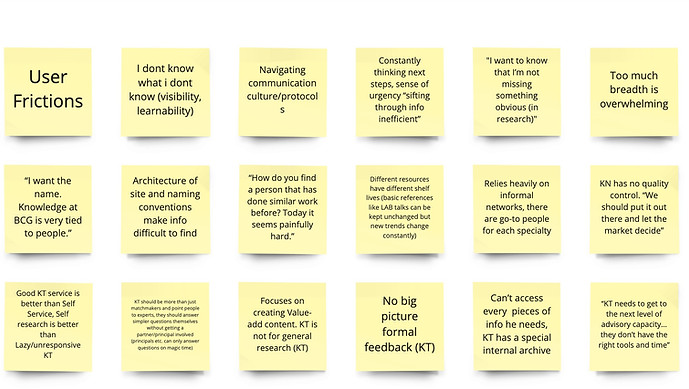
Pinpoint User Problems
With the synthesis learning in mind, we applied a rigorous process to identify user frictions and test new ideas during the first round of interviews. We ran 60-min interview with 57 BCGers - our target audience - in the following three practices:
-
General discussion to understand & evaluate intent on KN platforms
-
Shadowing walk-through to investigate search pathways by use case
-
Card-sorting activity to understand the importance of proposed/existing features and to co-create enhancement ideas
100+
Frictions & Opportunities
50+
Ideas/Concepts
Identified Top 3 User Barriers
We walked out of interviews with 100+ frictions and opportunities and 50+ ideas/concepts to start our ideation phase, and all those learnings were the main factors driving our design directions.
80%
users
Resorting to manual workarounds/ triangulation through personal knowledge and network if no useful result returned
75%
users
Poor discoverability with hidden tools/ taxonomy that can help enhance search effectiveness
60%
users
Lack of confidence in the quality of the search results and system inconsistencies that limit users from leveraging existing expertise
After Design Audit, Syntheses and Interviews, 4 User Steps and 10 Feature Areas Have Been Defined
After interview syntheses, we broke down the search experience into four primary user steps with ten feature areas. To conduct each the building process inclusively and effectively, we set our interview guideline and testing practices against those four user steps and ten features to test, validate, ideate, and redesign. The four steps and ten features as defined below.
Search Initiation
-
Search intention
-
Search alternatives
Search Result Presentation
-
Content types
-
Scanning options
-
User types
Search Result Refinement
-
Filtering systems
-
Filter suggestions
Search Result Consumption
-
Result previews
-
Saved search
-
Feedback loop
IDEATION & DESIGN PROCESS
_____
Exemplar Analysis
I have benchmarked best-in-class exemplars to establish north-star visions and used them as inspirations to sketch out ideas for previously defined feature areas.

Wireframe
I ideated and designed wireframes for each of the features that we need to improve and use them to drive user testing.


Click the Arrow Button to explore all wireframes
User Testing | Qual Research
I used the wireframes to facilitate multiple user testing interviews over Zoom to get feedback on the UX solutions. Firstly, I showed the wireframes and gathered initial reactions during the beginning of the testings. Then, I conducted card sorting and solution ranking practices to ask users to prioritize the wireframe solutions that might replaceable or serve similar search intentions. Hence I can narrow down the solutions and hold a clear UX direction towards the final design.


A screenshot of through Zoom screen sharing to walk through wireframes and gather direct feedback in detailed level from users
A view of the feature ranking board I applied for user desirability testing. I ask users to rank the presented ideas based on their searching needs in order to refine design based on what is desired.
Quant Survey | Quant Research
Besides the moderated Zoom user testing, we also ran surveys on Adobe Analytics for the wireframes and ideas to get a quantitative feature resonance to validate value props and prioritize our features. With over 500 quantitative testing results, we extensively tested our feature solutions. Combining with the results from qual testing, I complied a set of features with a clear execution plan towards the final experience. The image below shows the ranking of the top five features out of the quant survey.
* Feature ranking in the scale of 1 to5, 1 as being most helpful and 5 as being least helpful.


